2024
based in Reikjavík, iceland
DESIGNED & DEVELOPED
BY DIEGO ARNANZ
BY DIEGO ARNANZ


December 2025
Budget One
Branding
Art direction

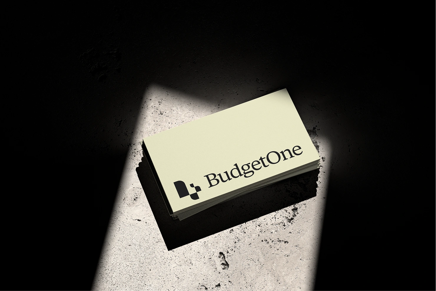
The identity is built around the concept of structure and breakdown. BudgetOne lets users work with budgets at different levels, from a global overview to very detailed line items. The logo reflects this concept. It is made of bars inspired by financial charts that rise and fall to form a “B.” The structure of the logo also mirrors the tool’s ability to break budgets into smaller, organized sections.
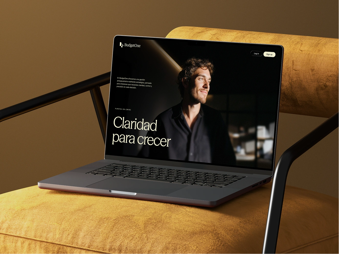
The color palette is designed for focus and readability. Neutral warm base colors provide a calm, professional foundation, while accent colors highlight key information. The palette works consistently in both light and dark modes, keeping communication clear across all interfaces.

.webp)
.webp)
Typography is a core element of this identity. The system combines an elegant, expressive display typeface for headlines, a highly readable body font for longer content, and a monospaced type for labels and supporting information
.webp)
.webp)
.webp)
Photography focuses always on the user, centering them in a hue of warm lighting and close framing to create a sense of connection and trust.

BudgetOne’s identity makes complex financial workflows feel clear and manageable. It fits naturally alongside other business tools while standing out through precision, structure, and thoughtful design.
.webp)