2024
based in Reikjavík, iceland
DESIGNED & DEVELOPED
BY DIEGO ARNANZ
BY DIEGO ARNANZ


May 2025
Branding
Art direction
Naming

Umbra is envisioned as a calm refuge within the city. A place to pause, disconnect from the noise, and experience food in a slower, more conscious way. The name comes from umbra, the darkest part of a shadow during an eclipse, and serves as a metaphor for stillness, introspection, and clarity. This celestial reference shaped a brand narrative rooted in both nature and elegance.
The identity balances tradition and modernity. The logo is heavily inspired by the hand-painted signs of historic Madrid storefronts and the city’s traditional ceramic street name plaques, reinterpreted through a clean, contemporary lens. Font choices across the brand reflect these references, grounding the identity in a familiar visual language while introducing a modern perspective.
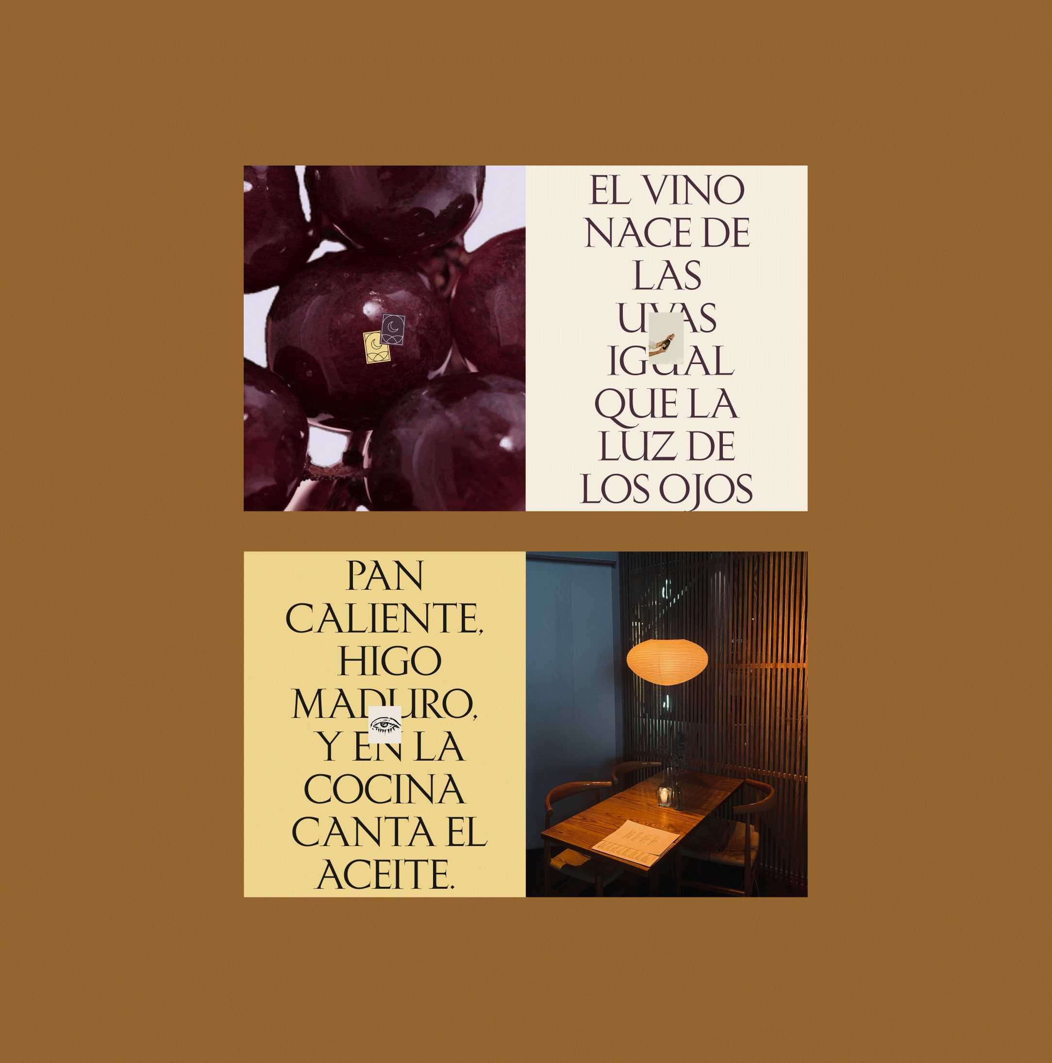


The color palette intentionally avoids the predictable earthy tones often seen in plant-based branding. Instead, it draws from the richness of the Iberian landscape and its symbolic weight. Deep fig and plum hues paired with golden yellows evoke wheat fields, late summer sunsets, wine, and harvest. These tones also reference the passing of time, the interplay of day and night, and the natural cycles that guide both the land and the body.


Umbra’s concept is also deeply intertwined with Spanish cultural history. Fragments of poems from celebrated authors such as Federico García Lorca, Antonio Machado, Juan Ramón Jiménez, and Gloria Fuertes are subtly incorporated into the storytelling and spatial experience of the brand. These poetic moments evoke silence, shadow, and introspection, adding emotional texture and connecting guests with a broader sense of place and identity. The restaurant becomes not only a culinary refuge, but also a cultural one.

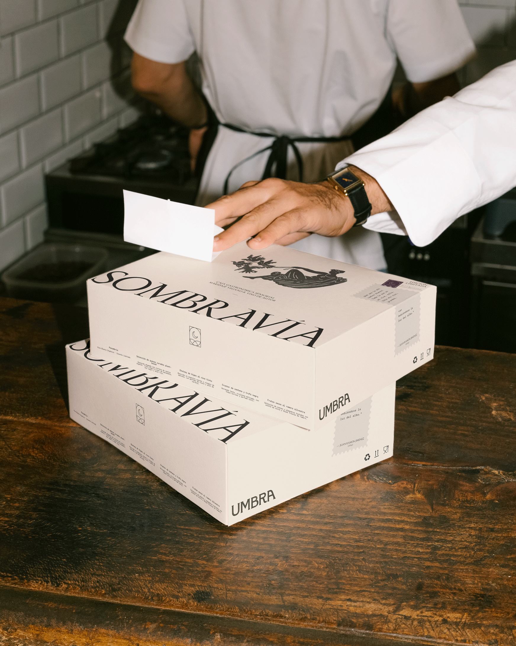


Umbra’s visual language is grounded and inviting, reflecting the restaurant’s mission to make plant-based dining not only elevated but also approachable. It’s a refuge from the chaos of the city, offering a brief escape into something simpler and more profound.


