2024
based in Reikjavík, iceland
DESIGNED & DEVELOPED
BY DIEGO ARNANZ
BY DIEGO ARNANZ


April 2025
Loaloa
Art direction
Branding
Illustration

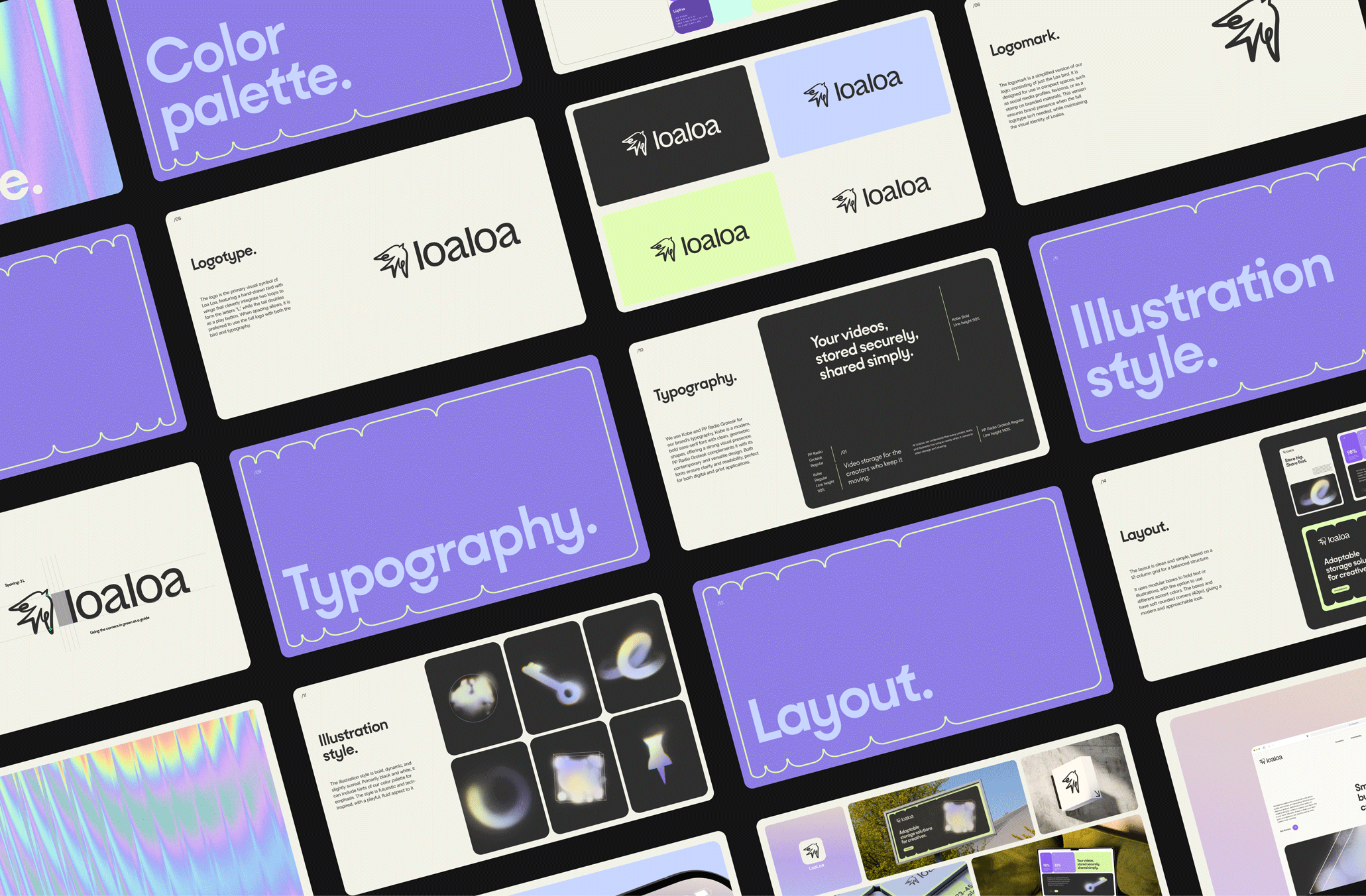
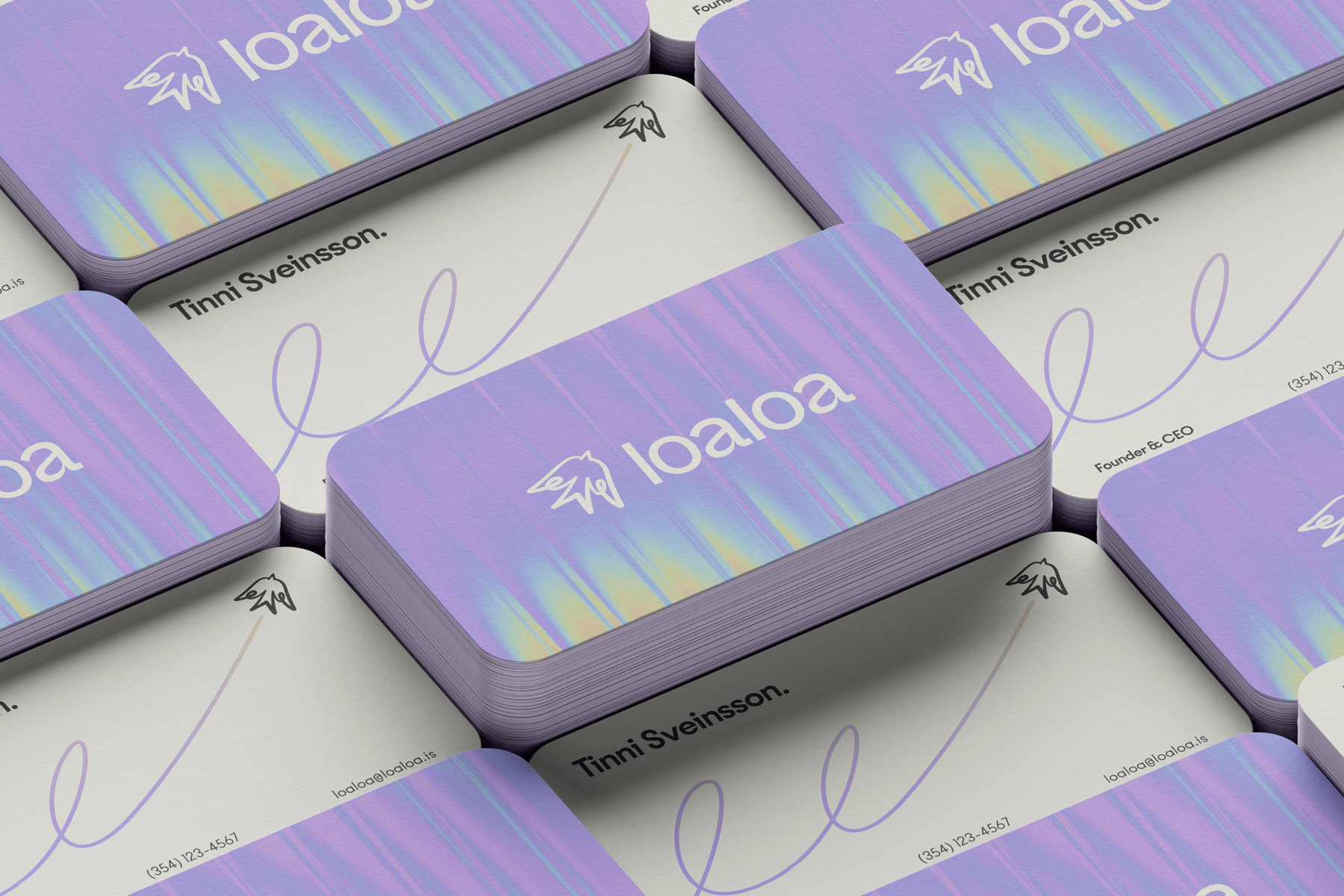
Inspired by Icelandic spring, the color palette pulls from wild lupines and shifting tones to create something vivid and dreamy, that offers a fresh alternative to the cold, corporate feel of typical tech brands.
The typography is clean but organic, with playful details that add character without sacrificing clarity. Paired with flexible layouts and adaptable forms, the system is designed to work across a range of applications, from interfaces to printed materials. Always consistent, but never stiff.


.jpg)
This identity was designed to be reliable, adaptable, and approachable, just like the product behind it. A secure, thoughtfully built space for big ideas and even bigger files.

.jpg)